I recently heard from an old colleague, Andrew. He was reaching out to congratulate me on releasing Peasy (🎉!), and he had questions for me on the italics in the typeface: How did I make the choices to design specific letters the way I did?
History and use of italics
Italic type was first used by a Venetian printer named Aldus Manutius in the year 1500. The shapes of the letters in italic type were based on a stylized form of calligraphic writing used by scribes and scholars in the 15th century.
These letters had a slight slant to the right and more compressed proportions when compared to the other type popular at the time: blackletter type, the style we might call ‘gothic’ which you typically see in present-day newspaper mastheads; and roman type, the most typical style of text today.
Manutius used this style of type, italic type, as the main text in his small format books, and this style of type was widely copied over the next few decades in book publishing. It was another century or so before we started to see italics used the way we do today, to show emphasis in conjunction with the roman type in a printed work.
The use of italics has changed and evolved over the centuries. In researching this post, I was surprised to learn that the words in italics in the King James Version were to de-emphasize words that have no equivalent in the original text but are needed in English: “And God saw the light, that it was good.”
Today, we can use italics in running text for a number of purposes: for stress, the titles of works, foreign words, or scientific terms. Italics are also useful in design and layout—to set apart pull quotations or captions, or to make a stylistic statement.
Designing italics
When a type designer works on the italic style of a typeface, one of the first choices they make is the italic angle. Generally, italics slant between 4 and 14 degrees. In a sans serif typeface, where the shapes of letters are usually more similar to the roman than in a serif face, the slanting angle is the most distinctive aspect of the italic style. In Peasy, I settled on a 10° angle.
To get a starting point on the italics, the designer usually will start from the roman style, apply the slant angle through software, then make many optical corrections. Even in sans serif faces that have an ‘oblique’ italic style, the curves and thicks and thins need to be adjusted manually so they feel natural to the italic shapes and not just applied mechanically.

In the humanist sans serif Peasy, the italic style is a “true” italic, not an oblique, and it has some different letter constructions that don’t exist in the roman. These were the letters Andrew asked me about: the lowercase a, with its single story form and no upper stem; the k, with a looping and enclosed counter shape; and the e, with rounding on the right of the counter shape.
The italics for a typeface are a style where you can express yourself with a little flair and personality, what Andrew described in his email as “a touch of whimsy.” The text you set apart in italics should feel more ‘special,’ so I think a bit of expressiveness in the letter shapes is called for.
You can use the coupon code EASYPEASY at checkout for 50% of your purchase of Peasy through the end of September.
Upcoming talk on Zoom
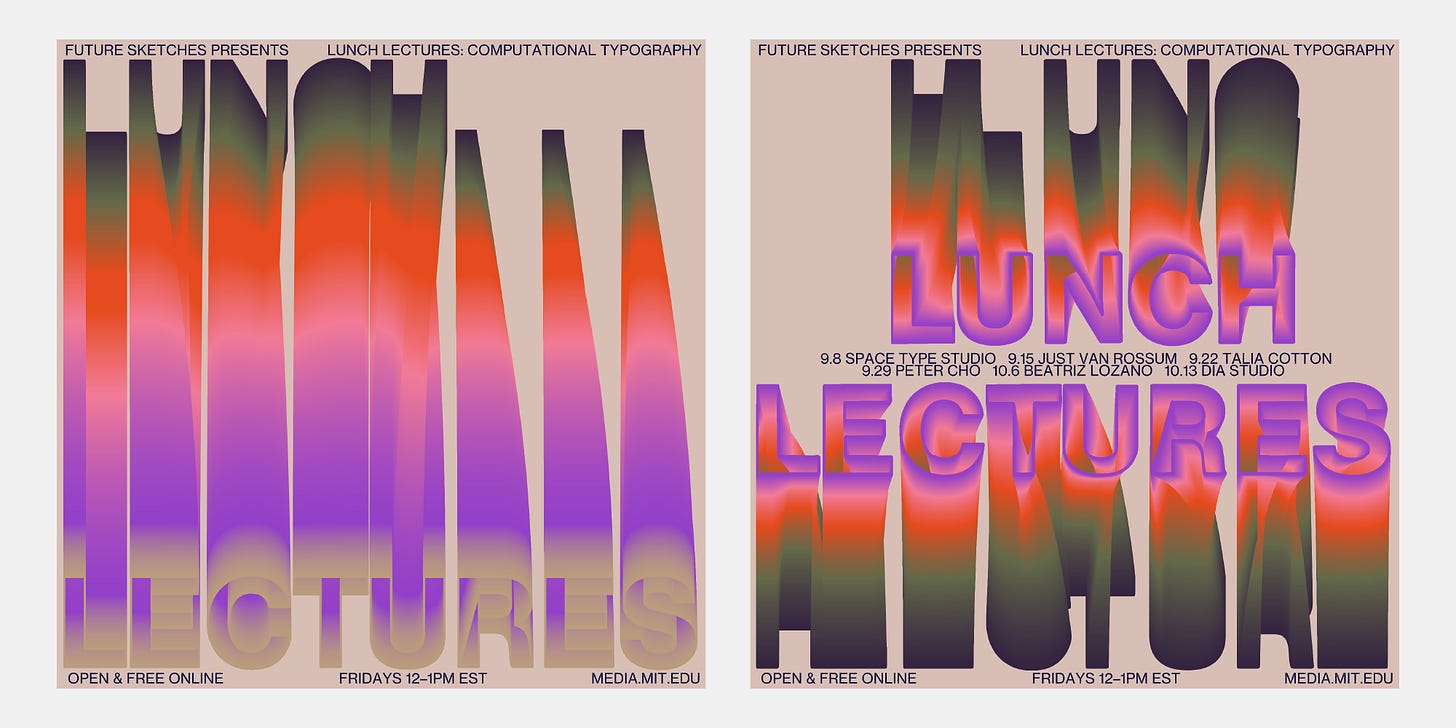
I’ll be speaking on Friday, September 29 at 12pm ET as part of the MIT Media Lab Lunch Lecture Series, “Computational Typography.” I’m an alum of the Media Lab, and I’m honored and a bit nervous to be speaking. I’ll be sharing experiments and designs I’ve made over the years, along with some thoughts about what fascinates us so much about letters.
The talk will be free and open to the public. Check out this link to read about the series and find the Zoom link: https://www.media.mit.edu/posts/lunch-lectures-computational-typography/
Sneak peek
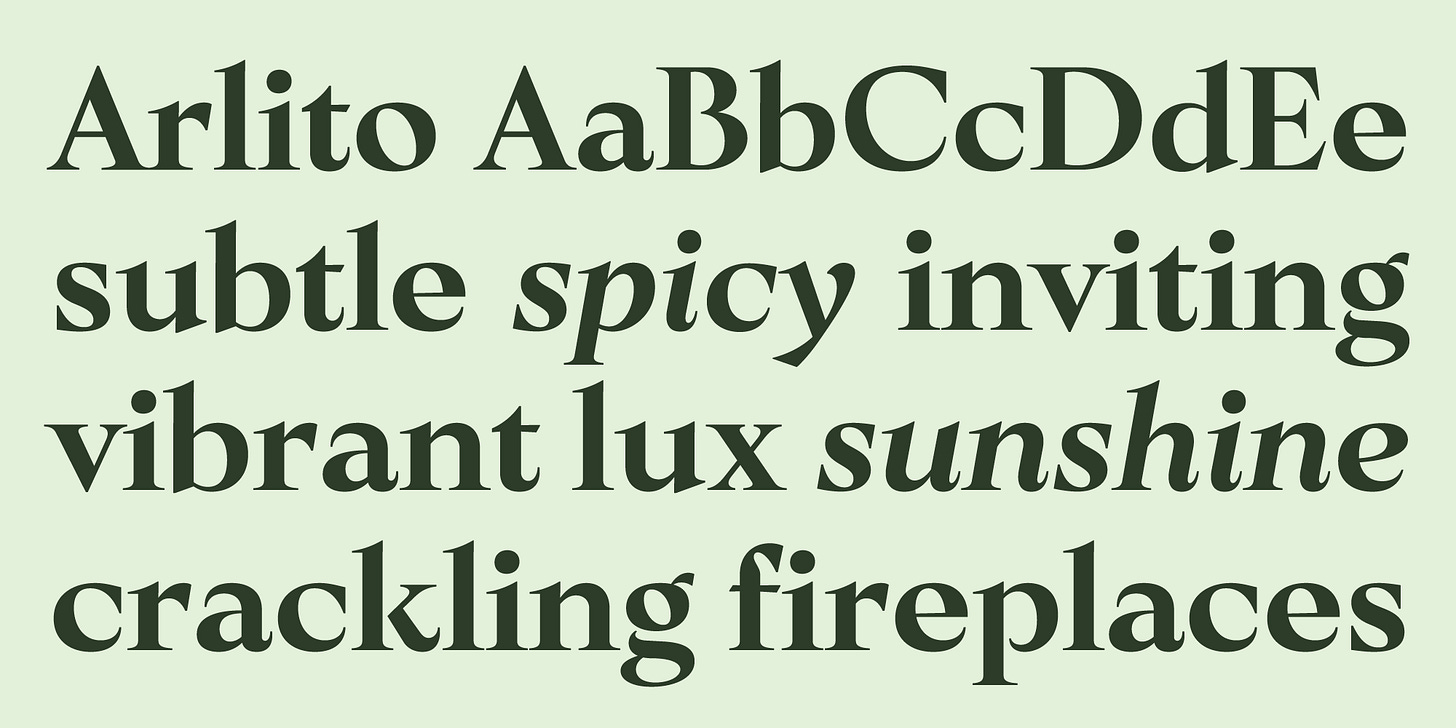
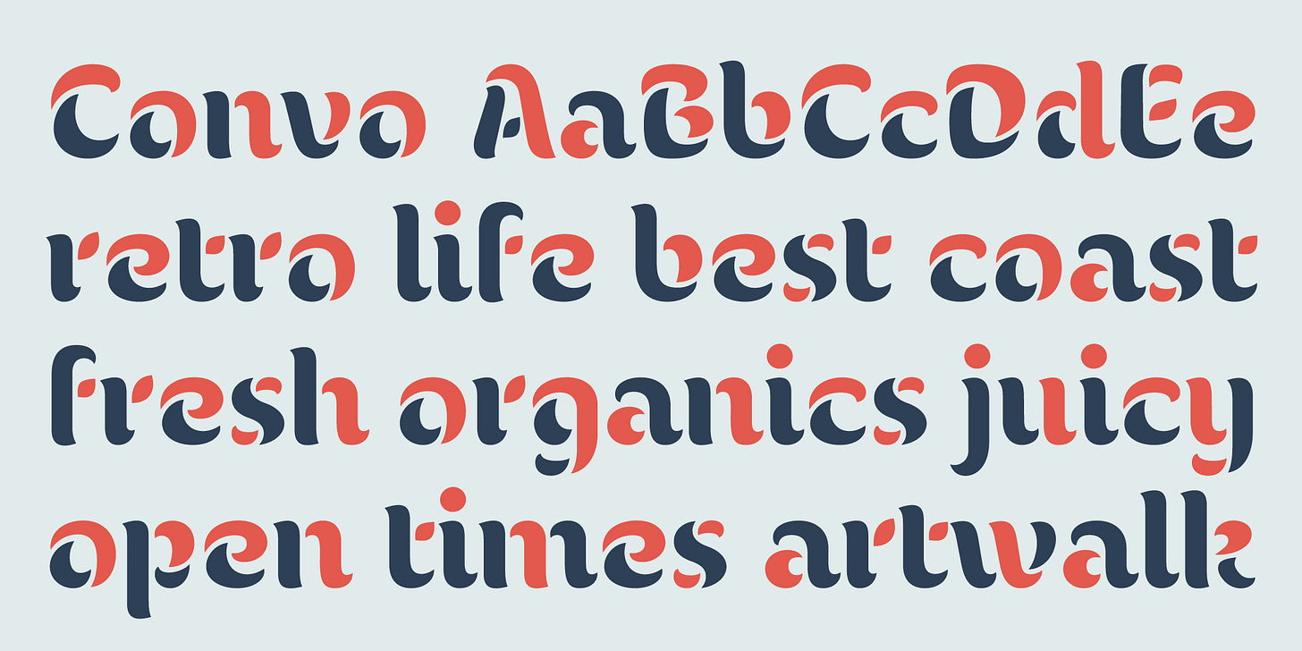
I’ve been working on a couple of new typefaces!
Arlito is a high-contrast display typeface inspired by show card lettering from the 1910s.
Convo is a playful, unusual stencil with multi-color possibilities.
What do you think? Would welcome your thoughts or feedback!


